Sunday, March 27, 2011

Hogwart's Halloween

I've never claimed to be up-to-date on my scrapbooks so it will not come as too much of a shock that today I'm sharing a 2-page layout of photos from last Halloween.

My eldest son decided he wanted to be Harry Potter (we're reading the books to him at bedtime) so off we went to our local Value Village where we purchased a Gryffindor robe, glasses, wand and broomstick. My younger son ended up selecting a Slytherin robe for his costume but he insisted on having glasses just like his brother. The result was a very frustrated little boy because everyone kept commenting on the two cute Harry Potters. "I'm Draco Malfoy" he would insist. We finally determined an explanation for the glasses - he was Draco Malfoy but drank some polyjuice potion to turn into Harry Potter and he was only part way through the transformation.

Regardless of the costume confusion, both boys had a lot of fun running around casting "expelliarmus" and "riddikulus" spells at everything that moved.

 
I found some Harry Potter specific paper and embellishments for the layout - Creative Imaginations has an entire line of papers, stickers and die cuts to choose from! I also searched out a free Harry Potter font online and used it to make the title which I printed off on the paper prior to adding all the photos.

The final step was journalling but you really can't make it out well in the pictures. I used a fine black pen and wrote in many of the blank areas of the pages but the fineness of the ink makes the words blend into the background pattern ... not sure if I like that or not. Hmmm.

 
Challenges:


Tuesday, March 22, 2011

Star

I'm not sure what's up with me but I've been doing quite a bit of scrapbooking lately. Usually I make cards because they are so much quicker but I guess my mojo has been strong. I've also been getting lots of inspiration from my stack of scrapbooking magazines! For example, today's layout is inspired by Scrapbook Trends March 2011 Challenge Sketch (p. 84).
My darling son after he received an award at school

I tried a few different techniques for this layout which was pretty exciting. First off, I don't think I've ever layered this much, or used so many different papers. All of the papers are from Basic Grey's "Oliver" paper pack so I knew they went together but it was still pretty scary!

Then I couldn't find a background paper that I liked so I made my own! I started with a silver cardstock and then sponged on Jet Black distress ink in a random pattern. I should be honest though and admit that at first I was just inking up the edges of the paper but the sponge slipped and left a streak on the paper. I could've started over but instead I decided to go with it. In the end I love the rough, burnished appearance of paper.

I also inked up the letters and embellishments for the page. It was fun digging through my chipboard box for suitable shapes - I chose the spirals because they felt so festive. Some of the chipboard was already coloured, other pieces I inked.

I'm really going to try and make some cards this week so for you card-makers out there, stick with me! Thanks for visiting!

Challenges:

Saturday, March 19, 2011

Beware mice bearing gifts

I had fun creating these super-simple birthday cards that I'll be donating for Cards for Kids. I used an older sketch from Stamp With Fun, just flipping it and replacing the 3 embellishments with a sentiment in the opposite corner. In each case, I chose 2 coordinating patterned papers and then a matching colour scheme for the present. The papers came out of the scrap bin so I'm not sure about the line (although I suspect the right-hand card is Basic Grey).
 
Challenges:
 

Thursday, March 17, 2011

Ezee Pzee product reveal - Shelley's Borders!

I'm extremely excited and proud to reveal a brand-new product line from Ezee Pzee called "Shelley's Borders". And why does the line have my name in it? Because I got to help Kathy design it!!!! Isn't that just so cool?

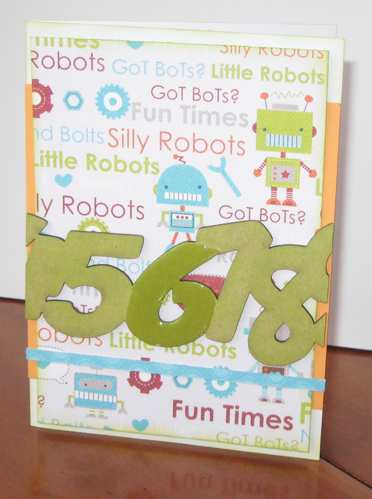
The first border in the set is "Numbers" - this is a line of numbers from 0 - 9 all done in a bubble-type font. I decided to cut the border to fit a standard card. I inked the entire thing and then added Glossy Accents to the #6. I inked the background paper with the same colour ink. The resulting card is a super easy birthday card for a 6-year old. Honestly, outside of drying time, this card took less than 15 minutes to make!
Oh, and an added bonus of cutting the border strip is that I was able to use the 1-2-3 section as part of my title on a layout about my boys' fascination with Lego Ninjago (I'll post this layout another time as it is still in progress).

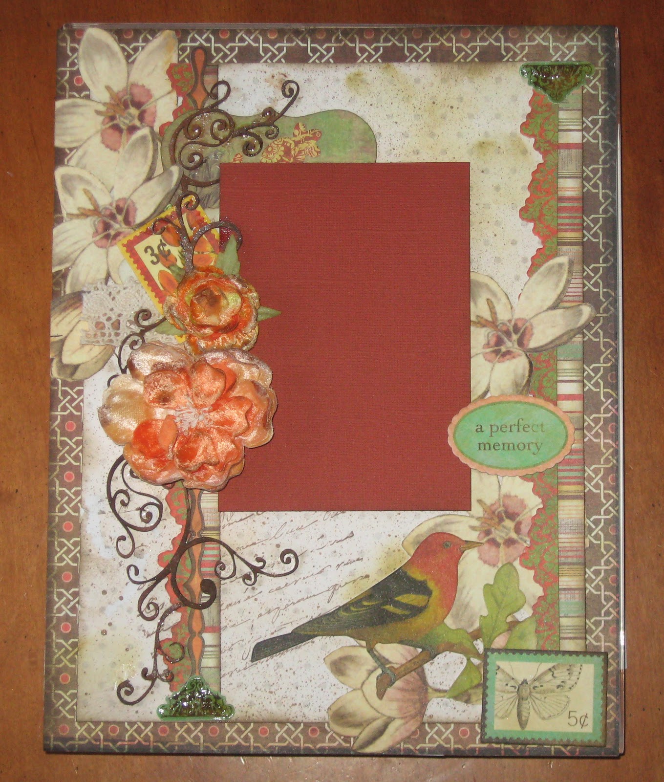
The next is a set of incredibly intricate flourish corners. These ended up being the perfect final touch for an elaborate layout that I made as part of a Basic Grey layout class (put on by Photo Express). The layout was supposed to include a series of pearls and gems but they just looked way too Disco so I was at a bit of a loss as to what to do. I think you'll agree though that these flourishes are the perfect touch. I used a Terra Cotta Spritzer to ink these up. I positioned these while they were still damp so that I was able to manipulate the curls around the different page elements.

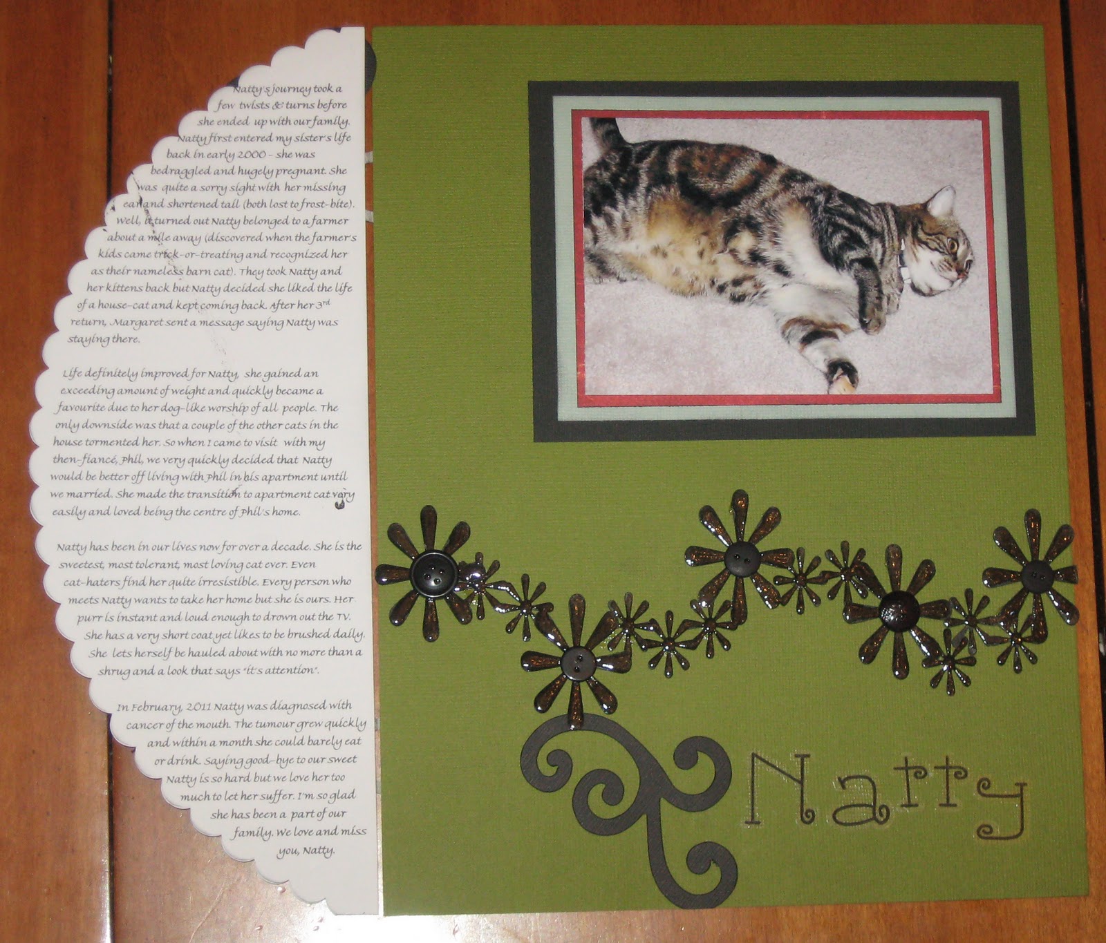
My very favourite border is the daisy chain set which includes 3 of these wonderful strings of flowers. My darling cat, Natty has been fighting cancer of the mouth and knowing that her time was short, I wanted to make a very special layout about her. Natty passed away the day after I finished this layout so I have to admit that I'm crying just looking at it. She was a tremendous cat!
To make this page, I inked the daisy chain border and then added Glossy Accents for dimension & shine. And then, because Natty was a very home-loving cat, I added buttons to the centre of the larger flowers. I wanted to include a lot of journalling so I put the shaped paper onto hinges (actually pieces cut from larger die cuts) with the story of Natty's journey written inside.

Anyway, I hope you check out Ezee Pzee and their wonderful products. And thanks for looking at my blog! I appreciate each and every person who takes the time to look at my projects (and even more to comment!).

Challenges:


"6" birthday card:


"Natty" layout:

"Floral flourshes" layout:

Monday, March 7, 2011

Sunshine

It's still cold outside but the sun is shining and so Spring must be on its way. Today's card is definitely looking to Spring and better weather. I used this sweet digi from Motivet, coupled with patterned paper from Basic Grey. You need to look somewhat closely but you'll see that the yellow strip across the middle of the card is fringed; I used the Martha Stewart fringe scissors for the first time!

I went back & forth on adding more embellishments versus leaving the card quite plain. As you can see I decided on clean & simple because (to be honest) I'm just so pleased with how the colouring of the kitten worked out and I wanted it to really stand out. Generally I'm very critical of my colouring but I think I got the shading just right for this one. As well, the background papers are so detailed, I didn't want to add any more noise to the card. I left this without a sentiment so that it could be used for just about any occasion.

Challenges:

Friday, March 4, 2011

What's Cookin'

I've been doing quite a bit of scrapbooking lately and am actually catching up a bit on my pages. Today, I'm sharing a one-page layout that I created around a meeting I had with Chef Michael Smith (isn't he a cutie?) at a fund-raiser dinner.

I tend to think of chefs in terms of their crisp white jackets so I kept the page clean and simple with a fair amount of white space and a minimum of embellishments. I picked up the papers and embellishment packs ("What's Cookin" SRM stickers and Doodlebug Cute Cuts tags) on my way to a crop and created the page without having the photo with me. So imagine my surprise when I got home and discovered that the blue matched the cover of Chef Michael Smith's cookbook and the burgundy accents matched my sweater - totally coincidental!

To create the page, I started with an off-centre patterned paper that I tore along the top. I then added a strip of burgundy striped paper along the bottom and then used the same paper to matte the title onto. The words along the top (do they apply to the food or to the chef? hmmm?) are clear stickers. I grouped two tags from the embellishment pack, along with a sentiment sticker for the bottom corner.

Challenges: